HighQuest Partners, LLC is an agribusiness consulting, marketing, and events firm. They are the producers of a number of products. Each product requires its own identity, one that fits the overall brand of the parent company. While at HighQuest as their sole designer, I was tasked with updating existing logos and designing new ones.
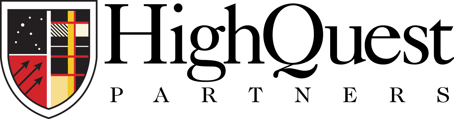
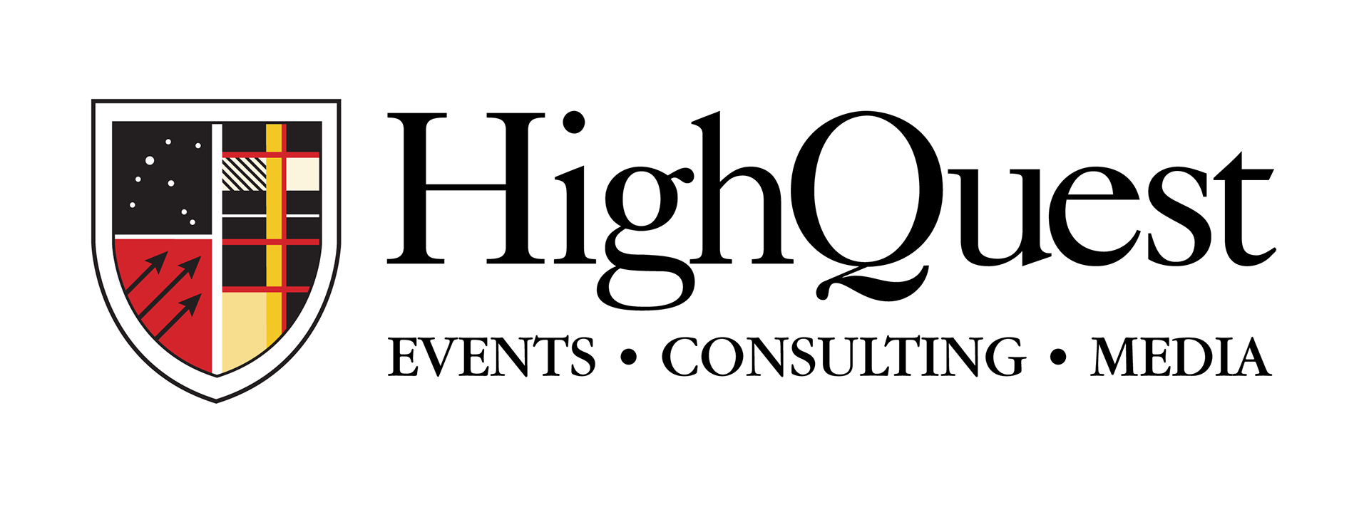
HighQuest Partners
The company started as a consulting firm and was looking to redesign it's primary identity to encompass the whole line of business. The redesign was clean and straightforward. The word "Partners" was removed and replaced with the three "silos" of their business: event's consulting, and media. In addition, the crest was redesigned to eliminate artifacting and allow for scaling.
From
To
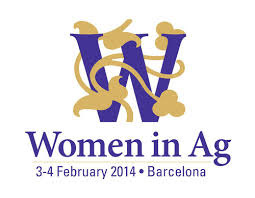
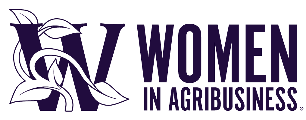
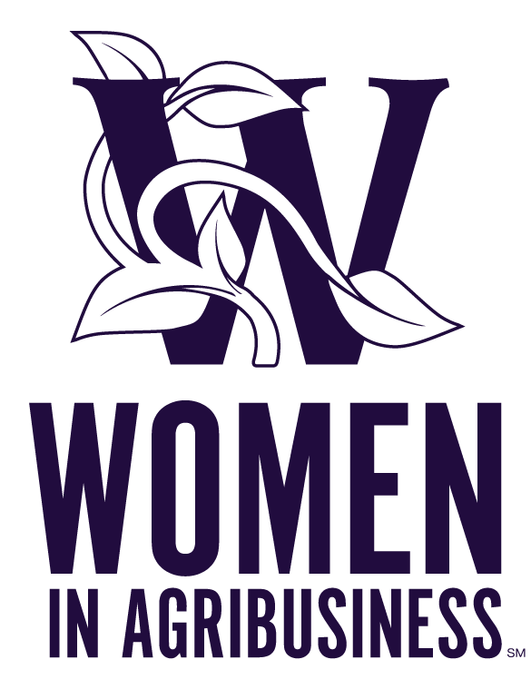
Women in Agribusiness
Women in Agribusiness required a full redesign. The symbol was simplified and consists of a vine wrapping around a "W." It eliminated the bronze, which muddied the color scheme on banners, and replaced it with clean negative space. The typeface was updated to a clean san serif, and the color was darkened to add a business tone to the product.
From
To
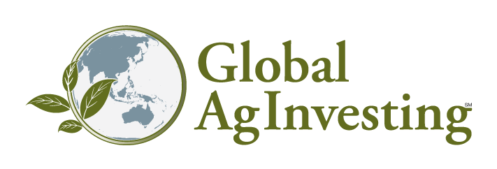
Global AgInvesting Regional Logos
As Global AgInvesting served the world and not a single region, I suggested changing the globe in the logos to fit the region in question.
New York

GAI New York

GAI Europe
GAI MIddle East
GAI Asia
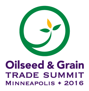
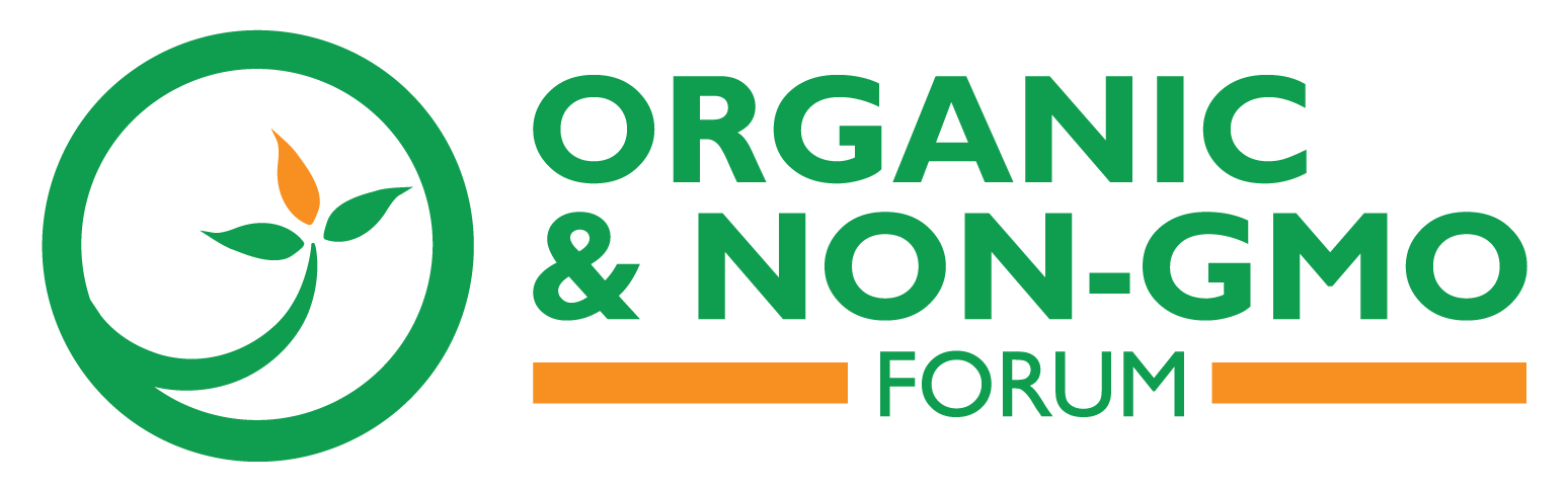
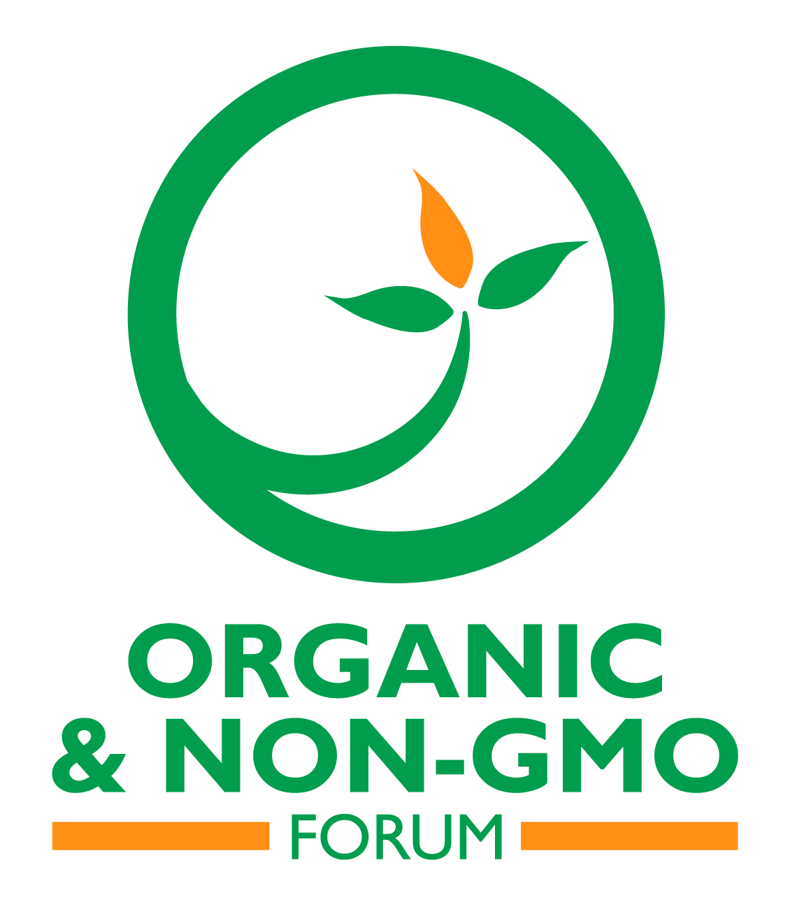
Oilseed & Grain Trade Summit
The Oilseed and Grain Trade Summit, or OGTS required the largest redesign as the product was discontinued in 2016. It was rebranded Organic & Non-GMO forum shortly after. The soy leaf in the cartouche was kept, as was the off-color oil drop leaf in its center. The color was updated to a brighter green and a complimentary modern gold. The gold bar was added to the base of the logoform to create a sense of weight.
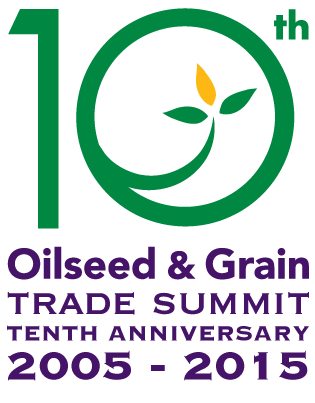
Toth Anniversary Logo Redesign
To
Original Logo Design
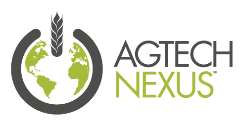
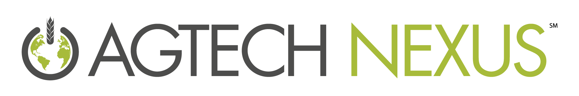
Agtech Nexus
Agtech Nexus was a spinoff event from the Global AgInvesting line of products. It required a clean, modern look that toyed with the combination of agribusiness and technology, a nexus between the two. I adopted the analog power symbol, replacing the bar with a stalk of wheat. Within the circle, I added the GAI globe. The dark gray and green of the symbol is based in technology. The whole logo works as a single color.
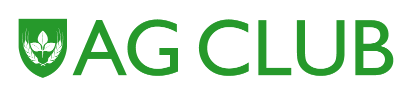
Ag Club
The Ag Club product required a logo similar to the old country club logos of the northeast. I took the base HighQuest Shield shape and added within a charge of a soy leaf bordered by two stalks of curved wheat.